You learned from the previous chapter that Bootstrap requires a containing element to wrap site contents.
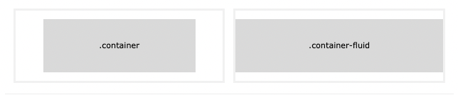
Containers are used to pad the content inside of them, and there are two container classes available:
.container class provides a responsive fixed width container.container-fluid class provides a full width container, spanning the entire width of the viewport
Table of Contents
Use the .container class to create a responsive, fixed-width container.
Note that its width (max-width) will change on different screen sizes:

Open the example below and resize the browser window to see that the container width will change at different breakpoints:
<!DOCTYPE html>
<html lang="en">
<head>
<title>Bootstrap Example</title>
<meta charset="utf-8">
<meta name="viewport" content="width=device-width, initial-scale=1">
<link href="https://cdn.jsdelivr.net/npm/bootstrap@5.1.3/dist/css/bootstrap.min.css" rel="stylesheet">
<script src="https://cdn.jsdelivr.net/npm/bootstrap@5.1.3/dist/js/bootstrap.bundle.min.js"></script>
<style>
#a1 {
background-color: aquamarine;
}
</style>
</head>
<body>
<div class="container">
<h1>My First Bootstrap Page</h1>
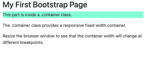
<p id="a1">This part is inside a .container class.</p>
<p>The .container class provides a responsive fixed width container.</p>
<p>Resize the browser window to see that the container width will change at different breakpoints.</p>
</div>
</body>
</html>
Result View Example
Use the .container-fluid class to create a full width container, that will always span the entire width of the screen (width is always 100%):
<!DOCTYPE html>
<html lang="en">
<head>
<title>Bootstrap Example</title>
<meta charset="utf-8">
<meta name="viewport" content="width=device-width, initial-scale=1">
<link href="https://cdn.jsdelivr.net/npm/bootstrap@5.1.3/dist/css/bootstrap.min.css" rel="stylesheet">
<script src="https://cdn.jsdelivr.net/npm/bootstrap@5.1.3/dist/js/bootstrap.bundle.min.js"></script>
<style>
#a1 {
background-color: aquamarine;
}
</style>
</head>
<body>
<div class="container-fluid">
<h1>My First Bootstrap Page</h1>
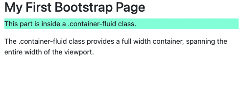
<p id="a1">This part is inside a .container-fluid class.</p>
<p>The .container-fluid class provides a full width container, spanning the entire width of the viewport.</p>
</div>
</body>
</html>
Result View Example
By default, containers have left and right padding, with no top or bottom padding. Therefore, we often use spacing utilities, such as extra padding and margins to make them look even better. For example, .pt-5 means "add a large top padding":
<div class="container pt-5"></div>
<!DOCTYPE html>
<html lang="en">
<head>
<title>Bootstrap Example</title>
<meta charset="utf-8">
<meta name="viewport" content="width=device-width, initial-scale=1">
<link href="https://cdn.jsdelivr.net/npm/bootstrap@5.1.3/dist/css/bootstrap.min.css" rel="stylesheet">
<script src="https://cdn.jsdelivr.net/npm/bootstrap@5.1.3/dist/js/bootstrap.bundle.min.js"></script>
</head>
<body>
<div class="container pt-5">
<h1>My First Bootstrap Page</h1>
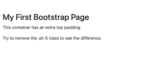
<p>This container has an extra top padding.</p>
<p>Try to remove the .pt-5 class to see the difference.</p>
</div>
</body>
</html>
Result View Example
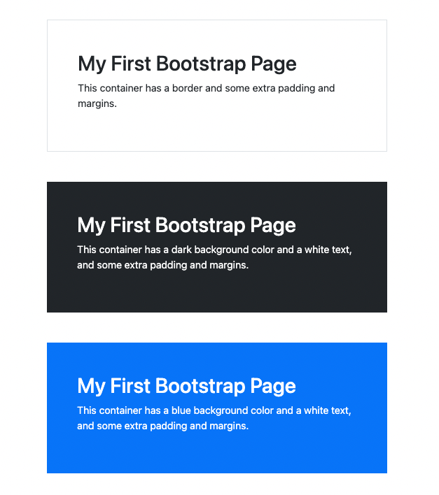
Other utilities, such as borders and colors, are also often used together with containers:
<!DOCTYPE html>
<html lang="en">

<head>
    <title>Bootstrap Example</title>
    <meta charset="utf-8">
    <meta name="viewport" content="width=device-width, initial-scale=1">
    <link href="https://cdn.jsdelivr.net/npm/bootstrap@5.1.3/dist/css/bootstrap.min.css" rel="stylesheet">
    <script src="https://cdn.jsdelivr.net/npm/bootstrap@5.1.3/dist/js/bootstrap.bundle.min.js"></script>
</head>

<body>

    <div class="container p-5 my-5 border">
        <h1>My First Bootstrap Page</h1>
        <p>This container has a border and some extra padding and margins.</p>
    </div>

    <div class="container p-5 my-5 bg-dark text-white">
        <h1>My First Bootstrap Page</h1>
        <p>This container has a dark background color and a white text, and some extra padding and margins.</p>
    </div>

    <div class="container p-5 my-5 bg-primary text-white">
        <h1>My First Bootstrap Page</h1>
        <p>This container has a blue background color and a white text, and some extra padding and margins.</p>
    </div>

</body>

</html>
Result View Example
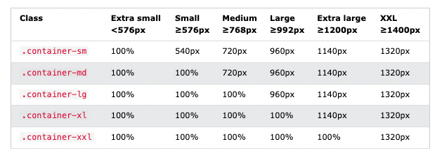
You can also use the .container-sm|md|lg|xl classes to determine when the container should be responsive.
The max-width of the container will change on different screen sizes/viewports:
<div class="container-sm">.container-sm</div>
<div class="container-md">.container-md</div>
<div class="container-lg">.container-lg</div>
<div class="container-xl">.container-xl</div>
<div class="container-xxl">.container-xxl</div>
<!DOCTYPE html>
<html lang="en">
<head>
<title>Bootstrap Example</title>
<meta charset="utf-8">
<meta name="viewport" content="width=device-width, initial-scale=1">
<link href="https://cdn.jsdelivr.net/npm/bootstrap@5.1.3/dist/css/bootstrap.min.css" rel="stylesheet">
<script src="https://cdn.jsdelivr.net/npm/bootstrap@5.1.3/dist/js/bootstrap.bundle.min.js"></script>
</head>
<body>
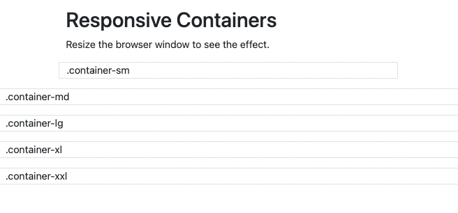
<div class="container pt-3">
<h1>Responsive Containers</h1>
<p>Resize the browser window to see the effect.</p>
</div>
<div class="container-sm border">.container-sm</div>
<div class="container-md mt-3 border">.container-md</div>
<div class="container-lg mt-3 border">.container-lg</div>
<div class="container-xl mt-3 border">.container-xl</div>
<div class="container-xxl mt-3 border">.container-xxl</div>
</body>
</html>
Result View Example
Document in project
You can Download PDF file.