Table of Contents
Bootstrap's grid system is built with flexbox and allows up to 12 columns across the page.
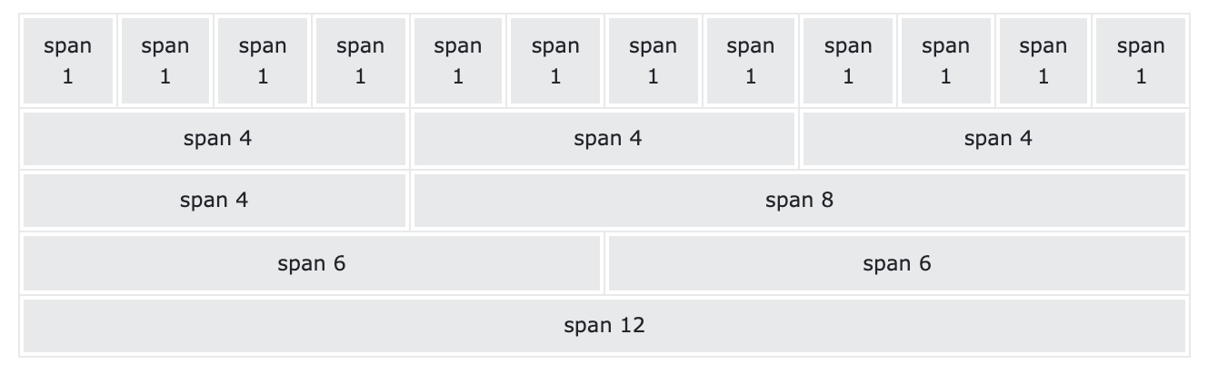
If you do not want to use all 12 columns individually, you can group the columns together to create wider columns:
The grid system is responsive, and the columns will re-arrange automatically depending on the screen size.
Make sure that the sum adds up to 12 or fewer (it is not required that you use all 12 available columns).
The Bootstrap 5 grid system has six classes:
.col- (extra small devices - screen width less than 576px).col-sm- (small devices - screen width equal to or greater than 576px).col-md- (medium devices - screen width equal to or greater than 768px).col-lg-(large devices - screen width equal to or greater than 992px).col-xl- (xlarge devices - screen width equal to or greater than 1200px).col-xxl- (xxlarge devices - screen width equal to or greater than 1400px)The classes above can be combined to create more dynamic and flexible layouts.
Tip: Each class scales up, so if you want to set the same widths for sm and md, you only need to specify sm.
The following is a basic structure of a Bootstrap 5 grid:
<!-- Control the column width, and how they should appear on different devices -->
<div class="row">
  <div class="col-*-*"></div>
  <div class="col-*-*"></div>
</div>
<div class="row">
  <div class="col-*-*"></div>
  <div class="col-*-*"></div>
  <div class="col-*-*"></div>
</div>

<!-- Or let Bootstrap automatically handle the layout -->
<div class="row">
  <div class="col"></div>
  <div class="col"></div>
  <div class="col"></div>
</div>
First example: create a row (<div class="row">). Then, add the desired number of columns (tags with appropriate .col-*-* classes). The first star (*) represents the responsiveness: sm, md, lg, xl or xxl, while the second star represents a number, which should add up to 12 for each row.
Second example: instead of adding a number to each col, let bootstrap handle the layout, to create equal width columns: two "col" elements = 50% width to each col, while three cols = 33.33% width to each col. Four cols = 25% width, etc. You can also use .col-sm|md|lg|xl|xxl to make the columns responsive.
<!DOCTYPE html>
<html lang="en">

<head>
    <title>Bootstrap Example</title>
    <meta charset="utf-8">
    <meta name="viewport" content="width=device-width, initial-scale=1">
    <link href="https://cdn.jsdelivr.net/npm/bootstrap@5.1.3/dist/css/bootstrap.min.css" rel="stylesheet">
    <script src="https://cdn.jsdelivr.net/npm/bootstrap@5.1.3/dist/js/bootstrap.bundle.min.js"></script>
</head>

<body>

    <div class="container-fluid mt-3">
        <h1>Basic Grid Structure</h1>
        <p>Resize the browser window to see the effect.</p>
        <p>The first, second and third row will automatically stack on top of each other when the screen is less than 576px wide.</p>

        <!-- Control the column width, and how they should appear on different devices -->
        <div class="row">
            <div class="col-sm-6 bg-primary text-white">50%</div>
            <div class="col-sm-6 bg-dark text-white">50%</div>
        </div>
        <br>

        <div class="row">
            <div class="col-sm-4 bg-primary text-white">33.33%</div>
            <div class="col-sm-4 bg-dark text-white">33.33%</div>
            <div class="col-sm-4 bg-primary text-white">33.33%</div>
        </div>
        <br>

        <!-- Or let Bootstrap automatically handle the layout -->
        <div class="row">
            <div class="col-sm bg-primary text-white">25%</div>
            <div class="col-sm bg-dark text-white">25%</div>
            <div class="col-sm bg-primary text-white">25%</div>
            <div class="col-sm bg-dark text-white">25%</div>
        </div>
        <br>

        <div class="row">
            <div class="col bg-primary text-white">25%</div>
            <div class="col bg-dark text-white">25%</div>
            <div class="col bg-primary text-white">25%</div>
            <div class="col bg-dark text-white">25%</div>
        </div>
    </div>

</body>

</html>
Result View Example

Document in project
You can Download PDF file.