
Below we have collected some examples of Bootstrap 5 grid layouts.
Table of Contents
Use the .col class on a specified number of elements and Bootstrap will recognize how many elements there are (and create equal-width columns). In the example below, we use three col elements, which gets a width of 33.33% each.
<div class="row">
  <div class="col">col</div>
  <div class="col">col</div>
  <div class="col">col</div>
</div>
<!DOCTYPE html>
<html lang="en">

<head>
    <title>Bootstrap Example</title>
    <meta charset="utf-8">
    <meta name="viewport" content="width=device-width, initial-scale=1">
    <link href="https://cdn.jsdelivr.net/npm/bootstrap@5.1.3/dist/css/bootstrap.min.css" rel="stylesheet">
    <script src="https://cdn.jsdelivr.net/npm/bootstrap@5.1.3/dist/js/bootstrap.bundle.min.js"></script>
</head>

<body>

    <div class="container-fluid mt-3">
        <h2>Three Equal Columns</h2>
        <p>Use the .col class on a specified number of elements and Bootstrap will recognize how many elements there are (and create equal-width columns). In the example below, we use three col elements, which gets a width of 33.33% each.</p>
        <div class="row">
            <div class="col bg-success">.col</div>
            <div class="col bg-warning">.col</div>
            <div class="col bg-success">.col</div>
        </div>
    </div>

</body>

</html>
Result View Example
You can also use numbers to control the column width. Just make sure that the sum adds up to 12 or fewer (it is not required that you use all 12 available columns):

<div class="row">
  <div class="col-4">col-4</div>
  <div class="col-4">col-4</div>
  <div class="col-4">col-4</div>
</div>
<!DOCTYPE html>
<html lang="en">

<head>
    <title>Bootstrap Example</title>
    <meta charset="utf-8">
    <meta name="viewport" content="width=device-width, initial-scale=1">
    <link href="https://cdn.jsdelivr.net/npm/bootstrap@5.1.3/dist/css/bootstrap.min.css" rel="stylesheet">
    <script src="https://cdn.jsdelivr.net/npm/bootstrap@5.1.3/dist/js/bootstrap.bundle.min.js"></script>
</head>

<body>

    <div class="container-fluid mt-3">
        <h2>Three Equal Columns</h2>
        <p>You can also use numbers to control the column width. Just make sure that the sum always adds up to 12:</p>
        <div class="row">
            <div class="col-4 bg-success">.col-4</div>
            <div class="col-4 bg-warning">.col-4</div>
            <div class="col-4 bg-success">.col-4</div>
        </div>
    </div>

</body>

</html>
Result View Example
To create unequal columns, you have to use numbers. The following example will create a 25%/50%/25% split:

<div class="row">
  <div class="col-3">col-3</div>
  <div class="col-6">col-6</div>
  <div class="col-3">col-3</div>
</div>
<!DOCTYPE html>
<html lang="en">

<head>
    <title>Bootstrap Example</title>
    <meta charset="utf-8">
    <meta name="viewport" content="width=device-width, initial-scale=1">
    <link href="https://cdn.jsdelivr.net/npm/bootstrap@5.1.3/dist/css/bootstrap.min.css" rel="stylesheet">
    <script src="https://cdn.jsdelivr.net/npm/bootstrap@5.1.3/dist/js/bootstrap.bundle.min.js"></script>
</head>

<body>

    <div class="container-fluid mt-3">
        <h2>Three Unequal Columns</h2>
        <p>To create unequal columns, you have to use numbers. The following example will create a 25%/50%/25% split:</p>
        <div class="row">
            <div class="col-3 bg-success">.col-3</div>
            <div class="col-6 bg-warning">.col-6</div>
            <div class="col-3 bg-success">.col-3</div>
        </div>
    </div>

</body>

</html>
Result View Example
However, it is enough to only set the width of one column, and have the sibling columns automatically resize around it. The following example will create a 25%/50%/25% split:

<div class="row">
  <div class="col">col</div>
  <div class="col-6">col-6</div>
  <div class="col">col</div>
</div>
<!DOCTYPE html>
<html lang="en">

<head>
    <title>Bootstrap Example</title>
    <meta charset="utf-8">
    <meta name="viewport" content="width=device-width, initial-scale=1">
    <link href="https://cdn.jsdelivr.net/npm/bootstrap@5.1.3/dist/css/bootstrap.min.css" rel="stylesheet">
    <script src="https://cdn.jsdelivr.net/npm/bootstrap@5.1.3/dist/js/bootstrap.bundle.min.js"></script>
</head>

<body>

    <div class="container-fluid mt-3">
        <h2>Three Unequal Columns</h2>
        <p>It is enough to only set the width of one column, and have the sibling columns automatically resize around it. The following example will create a 25%/50%/25% split:</p>
        <div class="row">
            <div class="col bg-success">.col</div>
            <div class="col-6 bg-warning">.col-6</div>
            <div class="col bg-success">.col</div>
        </div>
    </div>

</body>

</html>
Result View Example
<!-- Two equal columns -->
<div class="row">
  <div class="col">1 of 2</div>
  <div class="col">2 of 2</div>
</div>

<!-- Four equal columns -->
<div class="row">
  <div class="col">1 of 4</div>
  <div class="col">2 of 4</div>
  <div class="col">3 of 4</div>
  <div class="col">4 of 4</div>
</div>

<!-- Six equal columns -->
<div class="row">
  <div class="col">1 of 6</div>
  <div class="col">2 of 6</div>
  <div class="col">3 of 6</div>
  <div class="col">4 of 6</div>
  <div class="col">5 of 6</div>
  <div class="col">6 of 6</div>
</div>
<!DOCTYPE html>
<html lang="en">
<head>
<title>Bootstrap Example</title>
<meta charset="utf-8">
<meta name="viewport" content="width=device-width, initial-scale=1">
<link href="https://cdn.jsdelivr.net/npm/bootstrap@5.1.3/dist/css/bootstrap.min.css" rel="stylesheet">
<script src="https://cdn.jsdelivr.net/npm/bootstrap@5.1.3/dist/js/bootstrap.bundle.min.js"></script>
</head>
<body>
<div class="container-fluid mt-3">
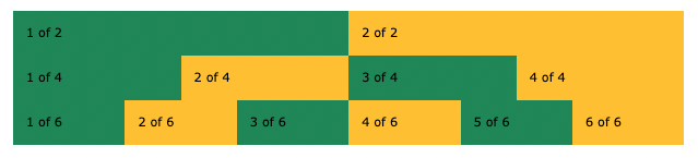
<h2>More Equal Columns</h2>
<div class="row">
<div class="col bg-success">1 of 2</div>
<div class="col bg-warning">2 of 2</div>
</div>
<br>
<div class="row">
<div class="col bg-success">1 of 4</div>
<div class="col bg-warning">2 of 4</div>
<div class="col bg-success">3 of 4</div>
<div class="col bg-warning">4 of 4</div>
</div>
<br>
<div class="row">
<div class="col bg-success">1 of 6</div>
<div class="col bg-warning">2 of 6</div>
<div class="col bg-success">3 of 6</div>
<div class="col bg-warning">4 of 6</div>
<div class="col bg-success">5 of 6</div>
<div class="col bg-warning">6 of 6</div>
</div>
</div>
</body>
</html>
Result View Example
You can also control how many columns that should appear next to each other (regardless of how many cols), with the .row-cols-* classes:
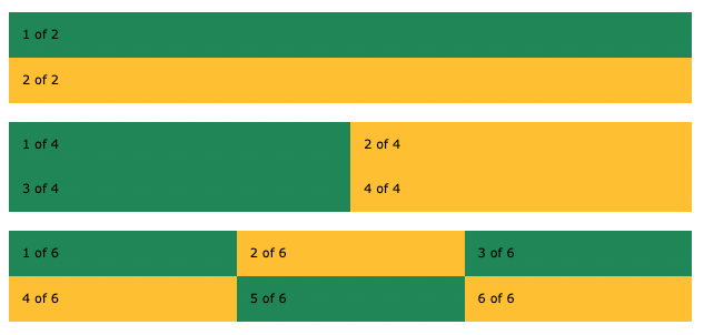
<div class="row row-cols-1">
  <div class="col">1 of 2</div>
  <div class="col">2 of 2</div>
</div>

<div class="row row-cols-2">
  <div class="col">1 of 4</div>
  <div class="col">2 of 4</div>
  <div class="col">3 of 4</div>
  <div class="col">4 of 4</div>
</div>

<div class="row row-cols-3">
  <div class="col">1 of 6</div>
  <div class="col">2 of 6</div>
  <div class="col">3 of 6</div>
  <div class="col">4 of 6</div>
  <div class="col">5 of 6</div>
  <div class="col">6 of 6</div>
</div>
<!DOCTYPE html>
<html lang="en">

<head>
    <title>Bootstrap Example</title>
    <meta charset="utf-8">
    <meta name="viewport" content="width=device-width, initial-scale=1">
    <link href="https://cdn.jsdelivr.net/npm/bootstrap@5.1.3/dist/css/bootstrap.min.css" rel="stylesheet">
    <script src="https://cdn.jsdelivr.net/npm/bootstrap@5.1.3/dist/js/bootstrap.bundle.min.js"></script>
</head>

<body>

    <div class="container-fluid mt-3">
        <h2>Row Cols</h2>
        <p>The .row-cols-* classes are used to set the number of columns that should appear next to each other.</p>

        <div class="row row-cols-1">
            <div class="col bg-success">1 of 2</div>
            <div class="col bg-warning">2 of 2</div>
        </div>
        <br>
        <div class="row row-cols-2">
            <div class="col bg-success">1 of 4</div>
            <div class="col bg-warning">2 of 4</div>
            <div class="col bg-success">3 of 4</div>
            <div class="col bg-warning">4 of 4</div>
        </div>
        <br>
        <div class="row row-cols-3">
            <div class="col bg-success">1 of 6</div>
            <div class="col bg-warning">2 of 6</div>
            <div class="col bg-success">3 of 6</div>
            <div class="col bg-warning">4 of 6</div>
            <div class="col bg-success">5 of 6</div>
            <div class="col bg-warning">6 of 6</div>
        </div>
    </div>

</body>

</html>
Result View Example
<!-- Two Unequal Columns -->
<div class="row">
  <div class="col-8">1 of 2</div>
  <div class="col-4">2 of 2</div>
</div>

<!-- Four Unequal Columns -->
<div class="row">
  <div class="col-2">1 of 4</div>
  <div class="col-2">2 of 4</div>
  <div class="col-2">3 of 4</div>
  <div class="col-6">4 of 4</div>
</div>

<!-- Setting two column widths -->
<div class="row">
  <div class="col-4">1 of 4</div>
  <div class="col-6">2 of 4</div>
  <div class="col">3 of 4</div>
  <div class="col">4 of 4</div>
</div>
<!DOCTYPE html>
<html lang="en">

<head>
    <title>Bootstrap Example</title>
    <meta charset="utf-8">
    <meta name="viewport" content="width=device-width, initial-scale=1">
    <link href="https://cdn.jsdelivr.net/npm/bootstrap@5.1.3/dist/css/bootstrap.min.css" rel="stylesheet">
    <script src="https://cdn.jsdelivr.net/npm/bootstrap@5.1.3/dist/js/bootstrap.bundle.min.js"></script>
</head>

<body>

    <div class="container-fluid mt-3">
        <h2>More Unequal Columns</h2>
        <div class="row">
            <div class="col-8 bg-success">1 of 2</div>
            <div class="col-4 bg-warning">2 of 2</div>
        </div>
        <br>
        <div class="row">
            <div class="col-2 bg-success">1 of 4</div>
            <div class="col-2 bg-warning">2 of 4</div>
            <div class="col-2 bg-success">3 of 4</div>
            <div class="col-6 bg-warning">4 of 4</div>
        </div>
        <br>
        <div class="row">
            <div class="col-4 bg-success">1 of 4</div>
            <div class="col-6 bg-warning">2 of 4</div>
            <div class="col bg-success">3 of 4</div>
            <div class="col bg-warning">4 of 4</div>
        </div>
    </div>

</body>

</html>
Result View Example
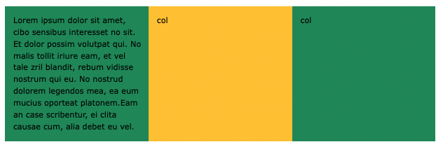
If one of the column is taller than the other (due to text or CSS height), the rest will follow:
<div class="row">
  <div class="col">Lorem ipsum...</div>
  <div class="col">col</div>
  <div class="col">col</div>
</div>
<!DOCTYPE html>
<html lang="en">

<head>
    <title>Bootstrap Example</title>
    <meta charset="utf-8">
    <meta name="viewport" content="width=device-width, initial-scale=1">
    <link href="https://cdn.jsdelivr.net/npm/bootstrap@5.1.3/dist/css/bootstrap.min.css" rel="stylesheet">
    <script src="https://cdn.jsdelivr.net/npm/bootstrap@5.1.3/dist/js/bootstrap.bundle.min.js"></script>
</head>

<body>

    <div class="container-fluid mt-3">
        <h2>Equal Height</h2>
        <p>If one of the column is taller than the other, the rest will follow.</p>
    </div>

    <div class="container-fluid">
        <div class="row">
            <div class="col bg-success">Lorem ipsum dolor sit amet, cibo sensibus interesset no sit. Et dolor possim volutpat qui. No malis tollit iriure eam, et vel tale zril blandit, rebum vidisse nostrum qui eu. No nostrud dolorem legendos mea, ea eum mucius oporteat platonem.Eam
                an case scribentur, ei clita causae cum, alia debet eu vel.</div>
            <div class="col bg-warning">.col</div>
            <div class="col bg-success">.col</div>
        </div>
    </div>

</body>

</html>
Result View Example
The following example shows how to create a two column layout, with another two columns inside one of the columns:

<div class="row">
  <div class="col-8">
    .col-8
    <div class="row">
      <div class="col-6">.col-6</div>
      <div class="col-6">.col-6</div>
    </div>
  </div>
  <div class="col-4">.col-4</div>
</div>
<!DOCTYPE html>
<html lang="en">

<head>
    <title>Bootstrap Example</title>
    <meta charset="utf-8">
    <meta name="viewport" content="width=device-width, initial-scale=1">
    <link href="https://cdn.jsdelivr.net/npm/bootstrap@5.1.3/dist/css/bootstrap.min.css" rel="stylesheet">
    <script src="https://cdn.jsdelivr.net/npm/bootstrap@5.1.3/dist/js/bootstrap.bundle.min.js"></script>
</head>

<body>

    <div class="container-fluid mt-3">
        <h2>Nested Columns</h2>
        <p>Add columns inside other columns:</p>
    </div>

    <div class="container-fluid">
        <div class="row">
            <div class="col-8 bg-warning p-4">
                .col-8
                <div class="row">
                    <div class="col-6 bg-light p-2">.col-6</div>
                    <div class="col-6 bg-secondary p-2">.col-6</div>
                </div>
            </div>
            <div class="col-4 bg-success p-4">.col-4</div>
        </div>
    </div>

</body>

</html>
Result View Example
The Bootstrap 5 grid system has five classes:
.col- (extra small devices - screen width less than 576px).col-sm- (small devices - screen width equal to or greater than 576px).col-md- (medium devices - screen width equal to or greater than 768px).col-lg- (large devices - screen width equal to or greater than 992px).col-xl- (xlarge devices - screen width equal to or greater than 1200px).col-xxl- (xxl devices - screen width equal to or greater than 1400px)The classes above can be combined to create more dynamic and flexible layouts.
Tip: Each class scales up, so if you wish to set the same widths for sm and md, you only need to specify sm.
The following example shows how to create a column layout that starts out stacked on extra small devices, before becoming horizontal on larger devices (sm, md, lg and xl):

<div class="row">
  <div class="col-sm-9">col-sm-9</div>
  <div class="col-sm-3">col-sm-3</div>
</div>
<div class="row">
  <div class="col-sm">col-sm</div>
  <div class="col-sm">col-sm</div>
  <div class="col-sm">col-sm</div>
</div>
<!DOCTYPE html>
<html lang="en">

<head>
    <title>Bootstrap Example</title>
    <meta charset="utf-8">
    <meta name="viewport" content="width=device-width, initial-scale=1">
    <link href="https://cdn.jsdelivr.net/npm/bootstrap@5.1.3/dist/css/bootstrap.min.css" rel="stylesheet">
    <script src="https://cdn.jsdelivr.net/npm/bootstrap@5.1.3/dist/js/bootstrap.bundle.min.js"></script>
</head>

<body>

    <div class="container-fluid mt-3">
        <h1>Stacked to Horizontal</h1>
        <p>Resize the browser window to see the effect.</p>
        <p>This example demonstrates a 75%/25% split on small, medium, large and xlarge devices. On extra small devices, it will stack (100% width).</p>
        <div class="container-fluid">
            <div class="row">
                <div class="col-sm-9 bg-success">col-sm-9</div>
                <div class="col-sm-3 bg-warning">col-sm-3</div>
            </div>
        </div>
        <br>
        <p>This example demonstrates a 33% split on small, medium, large and xlarge devices. On extra small devices, it will stack (100% width).</p>
        <div class="container-fluid">
            <div class="row">
                <div class="col-sm bg-success">col-sm</div>
                <div class="col-sm bg-warning">col-sm</div>
                <div class="col-sm bg-success">col-sm</div>
            </div>
        </div>
    </div>

</body>

</html>
Result View Example
<!-- 50%/50% split on extra small devices and 75%/25% split on larger devices -->
<div class="row">
  <div class="col-6 col-sm-9">col-6 col-sm-9</div>
  <div class="col-6 col-sm-3">col-6 col-sm-3</div>
</div>

<!-- 58%/42% split on extra small, small and medium devices and 66.3%/33.3% split on large and xlarge devices -->
<div class="row">
  <div class="col-7 col-lg-8">col-7 col-lg-8</div>
  <div class="col-5 col-lg-4">col-5 col-lg-4</div>
</div>

<!-- 25%/75% split on small devices, a 50%/50% split on medium devices, and a 33%/66% split on large and xlarge devices. On extra small devices, it will automatically stack (100%) -->
<div class="row">
  <div class="col-sm-3 col-md-6 col-lg-4">col-sm-3 col-md-6 col-lg-4</div>
  <div class="col-sm-9 col-md-6 col-lg-8">col-sm-9 col-md-6 col-lg-8</div>
</div>
<!DOCTYPE html>
<html lang="en">
<head>
<title>Bootstrap Example</title>
<meta charset="utf-8">
<meta name="viewport" content="width=device-width, initial-scale=1">
<link href="https://cdn.jsdelivr.net/npm/bootstrap@5.1.3/dist/css/bootstrap.min.css" rel="stylesheet">
<script src="https://cdn.jsdelivr.net/npm/bootstrap@5.1.3/dist/js/bootstrap.bundle.min.js"></script>
</head>
<body>
<div class="container-fluid mt-3">
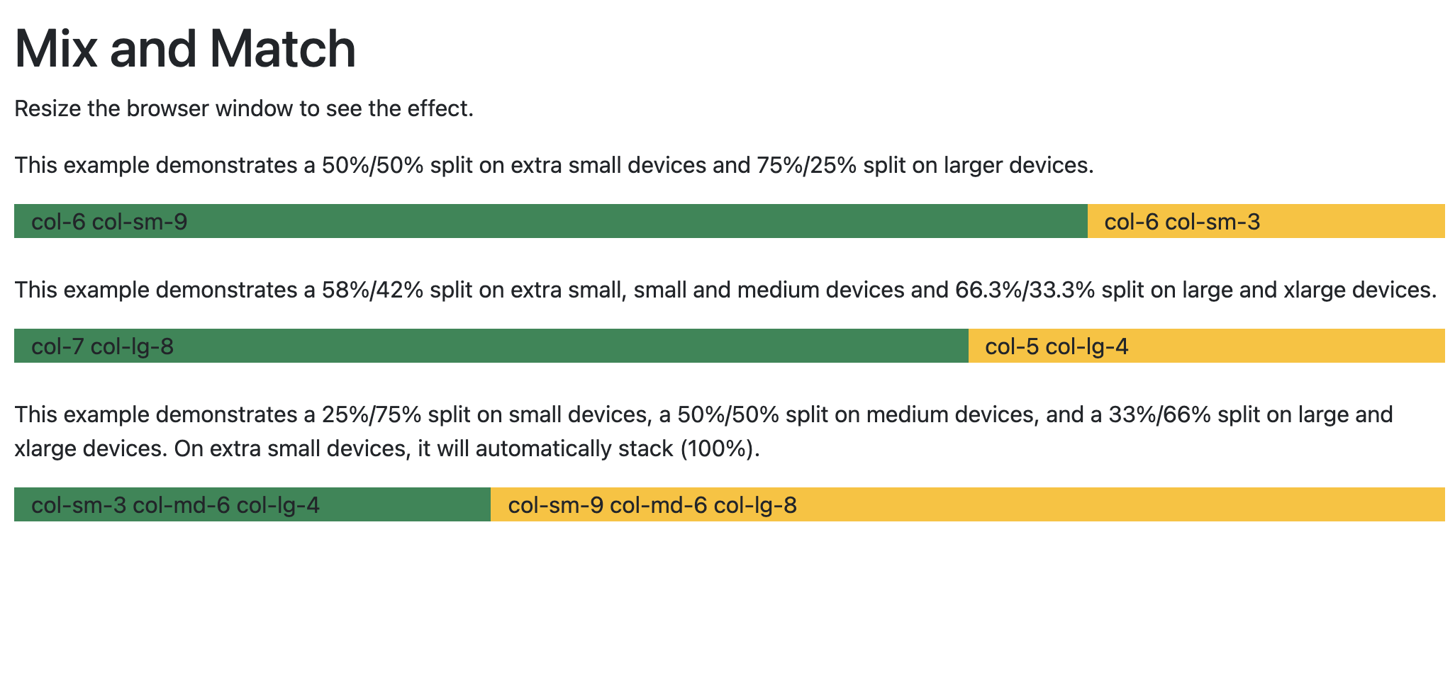
<h1>Mix and Match</h1>
<p>Resize the browser window to see the effect.</p>
<p>This example demonstrates a 50%/50% split on extra small devices and 75%/25% split on larger devices.</p>
<div class="container-fluid">
<div class="row">
<div class="col-6 col-sm-9 bg-success">col-6 col-sm-9</div>
<div class="col-6 col-sm-3 bg-warning">col-6 col-sm-3</div>
</div>
</div>
<br>
<p>This example demonstrates a 58%/42% split on extra small, small and medium devices and 66.3%/33.3% split on large and xlarge devices.</p>
<div class="container-fluid">
<div class="row">
<div class="col-7 col-lg-8 bg-success">col-7 col-lg-8</div>
<div class="col-5 col-lg-4 bg-warning">col-5 col-lg-4</div>
</div>
</div>
<br>
<p>This example demonstrates a 25%/75% split on small devices, a 50%/50% split on medium devices, and a 33%/66% split on large and xlarge devices. On extra small devices, it will automatically stack (100%).</p>
<div class="container-fluid">
<div class="row">
<div class="col-sm-3 col-md-6 col-lg-4 bg-success">col-sm-3 col-md-6 col-lg-4</div>
<div class="col-sm-9 col-md-6 col-lg-8 bg-warning">col-sm-9 col-md-6 col-lg-8</div>
</div>
</div>
</div>
</body>
</html>
Result View Example
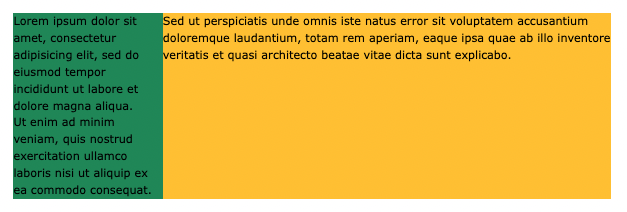
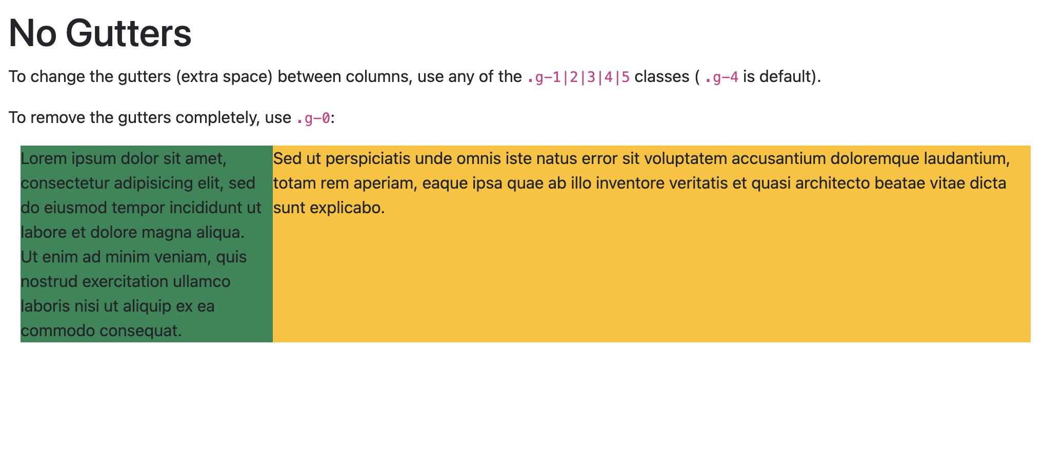
To change the gutters (extra space) between columns, use any of the .g-1|2|3|4|5 classes (.g-4 is default).
To remove the gutter completely, use .g-0 :
<div class="row g-0">
<!DOCTYPE html>
<html lang="en">

<head>
    <title>Bootstrap Example</title>
    <meta charset="utf-8">
    <meta name="viewport" content="width=device-width, initial-scale=1">
    <link href="https://cdn.jsdelivr.net/npm/bootstrap@5.1.3/dist/css/bootstrap.min.css" rel="stylesheet">
    <script src="https://cdn.jsdelivr.net/npm/bootstrap@5.1.3/dist/js/bootstrap.bundle.min.js"></script>
</head>

<body>

    <div class="container-fluid mt-3">
        <h1>No Gutters</h1>
        <p>To change the gutters (extra space) between columns, use any of the <code class="w3-codespan">.g-1|2|3|4|5</code> classes (
            <code class="w3-codespan">.g-4</code> is default). </p>
        <p>To remove the gutters completely, use <code class="w3-codespan">.g-0</code>:</p>

        <div class="container-fluid">
            <div class="row g-0">
                <div class="col-3 bg-success">
                    Lorem ipsum dolor sit amet, consectetur adipisicing elit, sed do eiusmod tempor incididunt ut labore et dolore magna aliqua.<br> Ut enim ad minim veniam, quis nostrud exercitation ullamco laboris nisi ut aliquip ex ea commodo consequat.
                </div>
                <div class="col-9 bg-warning">
                    Sed ut perspiciatis unde omnis iste natus error sit voluptatem accusantium doloremque laudantium, totam rem aperiam, eaque ipsa quae ab illo inventore veritatis et quasi architecto beatae vitae dicta sunt explicabo.
                </div>
            </div>
        </div>
    </div>

</body>

</html>
Result View Example
Document in project
You can Download PDF file.